# Modal
If you want to display some content on demand in a very subtle way, a Now UI Modal is the perfect choice for this. We created custom modal components based on Bootstrap.
To use the modal, first import it:
import {Modal} from 'src/components'
Global usage
Vue.component(Modal)
Local usage
export default {
 components: {
   Modal
 }
}
# Clasic modal
Classic, restyled modal
Modal title
Far far away, behind the word mountains, far from the countries Vokalia and Consonantia, there live the blind texts. Separated they live in Bookmarksgrove right at the coast of the Semantics, a large language ocean. A small river named Duden flows by their place and supplies it with the necessary regelialia. It is a paradisematic country, in which roasted parts of sentences fly into your mouth.
<template>
    <div>
      <p-button type="primary" @click.native="modals.classic = true">
        Classic modal
      </p-button>
      <modal :show.sync="modals.classic" headerClasses="justify-content-center">
        <h4 slot="header" class="title title-up">Modal title</h4>
        <p>Far far away, behind the word mountains, far from the countries Vokalia and Consonantia, there live
          the blind texts. Separated they live in Bookmarksgrove right at the coast of the Semantics, a large
          language ocean. A small river named Duden flows by their place and supplies it with the necessary
          regelialia. It is a paradisematic country, in which roasted parts of sentences fly into your
          mouth.</p>
        <template slot="footer">
          <p-button>Nice Button</p-button>
          <p-button type="danger" @click.native="modals.classic = false">Close</p-button>
        </template>
      </modal>
    </div>
</template>

<script>
    export default {
      data(){
        return {
          modals: {
            classic: false
          }
        }
      }
    }
</script>
# Notice modal
How Do You Become an Affiliate?
The first step is to create an account at Creative Tim. You can choose a social network or go for the classic version, whatever works best for you.

The first step is to create an account at Creative Tim. You can choose a social network or go for the classic version, whatever works best for you.

If you have more questions, don't hesitate to contact us or send us a tweet @creativetim. We're here to help!
<template>
    <div>
      <p-button type="info" @click.native="modals.notice = true">
        Notice modal
      </p-button>
      <modal :show.sync="modals.notice"
             footer-classes="justify-content-center"
             type="notice">
        <h5 slot="header" class="modal-title">How Do You Become an Affiliate?</h5>
        <template>
          <div class="instruction">
            <div class="row">
              <div class="col-md-8">
                <strong>1. Register</strong>
                <p class="description">The first step is to create an account at <a
                  href="https://www.creative-tim.com/">Creative Tim</a>. You can choose a social network or
                  go for the classic version, whatever works best for you.</p>
              </div>
              <div class="col-md-4">
                <div class="picture">
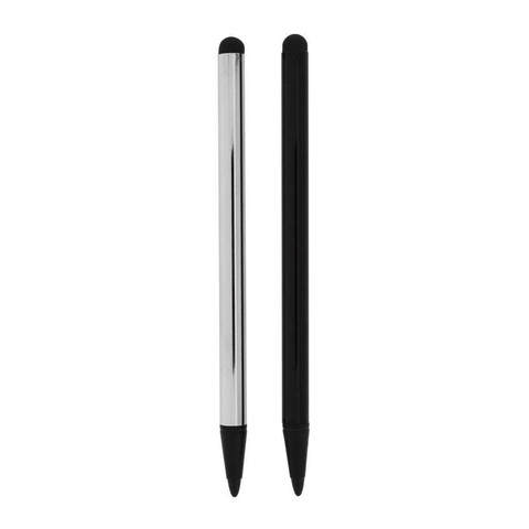
                  <img src="https://demos.creative-tim.com/vue-paper-dashboard-pro/documentation/static/img/tables/stylus.jpg" alt="Thumbnail Image" class="rounded img-raised">
                </div>
              </div>
            </div>
          </div>
          <div class="instruction">
            <div class="row">
              <div class="col-md-8">
                <strong>2. Apply</strong>
                <p class="description">The first step is to create an account at <a
                  href="https://www.creative-tim.com/">Creative Tim</a>. You can choose a social network or
                  go for the classic version, whatever works best for you.</p>
              </div>
              <div class="col-md-4">
                <div class="picture">
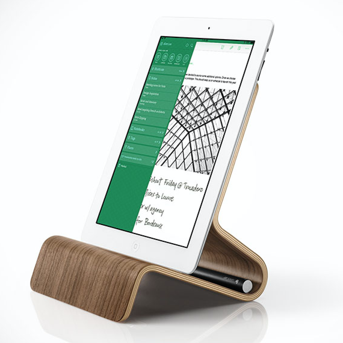
                  <img src="https://demos.creative-tim.com/vue-paper-dashboard-pro/documentation/static/img/tables/evernote.png" alt="Thumbnail Image" class="rounded img-raised">
                </div>
              </div>
            </div>
          </div>
          <p>If you have more questions, don't hesitate to contact us or send us a tweet @creativetim. We're
            here to help!</p>
        </template>
        <div slot="footer" class="justify-content-center">
          <p-button type="info" round @click.native="modals.notice = false">Sounds good!</p-button>
        </div>
      </modal>
    </div>
</template>

<script>
    export default {
      data(){
        return {
          modals: {
            notice: false
          }
        }
      }
    }
</script>
# Small modal
Best way to notify a user in a nice way.
Always have an access to your profile
<template>
    <div>
      <p-button @click.native="modals.mini = true">
        Small alert modal
      </p-button>
      <modal :show.sync="modals.mini"
             class="modal-primary"
             :show-close="false"
             header-classes="justify-content-center"
             type="mini">
        <div slot="header" class="modal-profile d-flex justify-content-center align-items-center">
          <i class="nc-icon nc-watch-time"></i>
        </div>
        <p>Always have an access to your profile</p>
        <template slot="footer">
          <p-button type="neutral" link>Back</p-button>
          <p-button type="neutral" link @click.native="modals.mini = false">Close</p-button>
        </template>
      </modal>
    </div>
</template>

<script>
    export default {
      data(){
        return {
          modals: {
            mini: false
          }
        }
      }
    }
</script>
# Modal Props
# Modal Events
| Event Name | Description | Parameters |
|---|---|---|
| close | Triggered when modal is closed | - |
# Slots
| Name | Description |
|---|---|
| default | Default content for the modal |
| header | Header content |
| close-button | Content for the close button. As fallback, there is the close icon inside this slot |
| footer | Modal footer content |